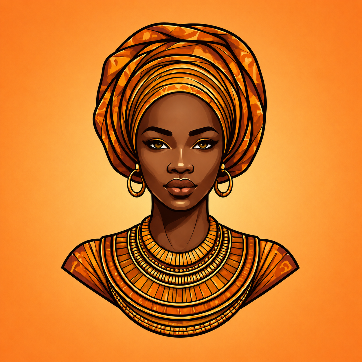
The African Color Theory — How to Use Bold Hues Without Overwhelming Your Space
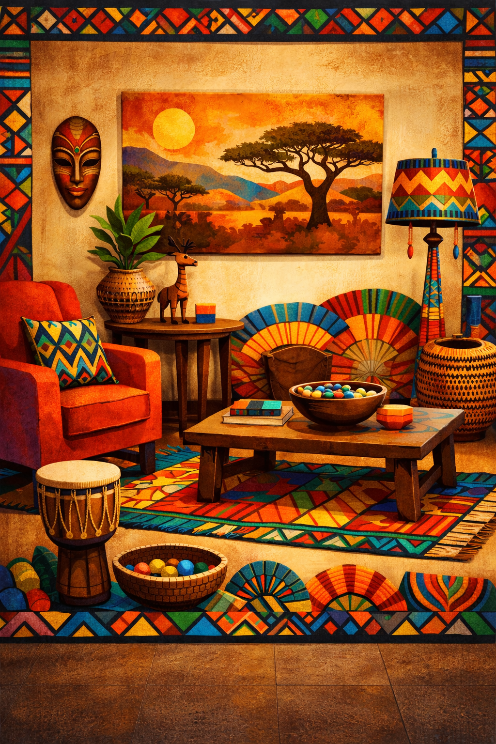
African homes have never been afraid of colour. Colour in African design is not decoration, it is language, emotion, memory, and power. Each shade carries meaning, history, and intention.
Yet modern African homeowners often fear bold colours, worried they’ll look “too much” or chaotic. The truth? When used correctly, African colour palettes create spaces that feel rich, grounded, and sophisticated, not loud.
This is how to master African colour theory the modern way.
Colour in Africa Is Symbolic, Not Random
Traditionally, colours communicate values:
Earth tones → grounding, ancestry, stability
White/cream → purity, spirituality, calm
Red/rust → strength, vitality, protection
Gold/yellow → wealth, royalty, warmth
Indigo/deep blue → wisdom, depth, tradition
Green → growth, life, fertility
Understanding meaning helps you design with purpose, not confusion.
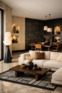
Start With a Neutral Base
The secret to bold African colour without chaos is restraint.
Anchor your space with:
Cream, beige, sand, or soft grey walls
Natural wood or stone floors
Neutral large furniture
Then introduce colour intentionally.
Neutrals are the canvas. Colour is the story.
One Dominant Colour Per Room
African interiors traditionally honour one strong colour energy per space.
Choose:
Terracotta living room
Indigo bedroom
Olive dining space
Mustard accent lounge
Let one colour lead, while others support quietly.
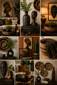
Use Colour Through Texture, Not Paint
Instead of painting entire walls bold shades, layer colour through:
Textiles (cushions, throws, rugs)
Artwork
Pottery
Woven baskets
Curtains
This approach feels elevated and flexible.
Balance Warm and Cool Tones
African palettes work best when warm and cool tones are balanced.
For example:
Terracotta + charcoal
Mustard + navy
Camel + deep green
This contrast keeps spaces visually calm and intentional.
Let Natural Light Guide Colour Choices
African sunlight is powerful.
Bold colours glow beautifully in natural light but can overwhelm dark spaces.
If your room gets little light, choose:
Muted versions of bold hues
Earthy tones over neon shades
Light determines luxury.
Cultural Patterns as Colour Anchors
Instead of scattering many colours, anchor your palette around one patterned piece:
Ankara cushion
Aso-oke wall art
Adire fabric
Mud cloth textile
Pull secondary colours from that pattern for cohesion.
Modern African Homes Prefer “Dusty” Colours
Modern Afro interiors lean toward:
Burnt orange instead of bright orange
Clay red instead of fire red
Muted gold instead of yellow
Soft indigo instead of cobalt
Dusty tones feel timeless and expensive.
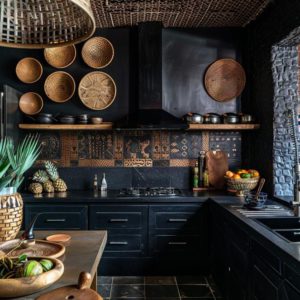
Use Black Sparingly but Intentionally
Black in African design represents authority and grounding.
Use it in:
Picture frames
Lighting fixtures
Accent chairs
Decorative bowls
Black sharpens the entire palette.
Colour Is Emotional — Trust How a Room Feels
African design is intuitive.
If a space feels:
Heavy → lighten the colour
Flat → add warmth
Chaotic → reduce colour layers
Your body will tell you before Pinterest does.
African colour is not loud, it is alive. When used with intention, it creates homes that feel rooted, powerful, and deeply personal.
Colour is not the enemy, Fear is.
“In African homes, colour is not decoration — it is identity.”
Shop Here-
https://www.ajokebrownmedia.com/shop